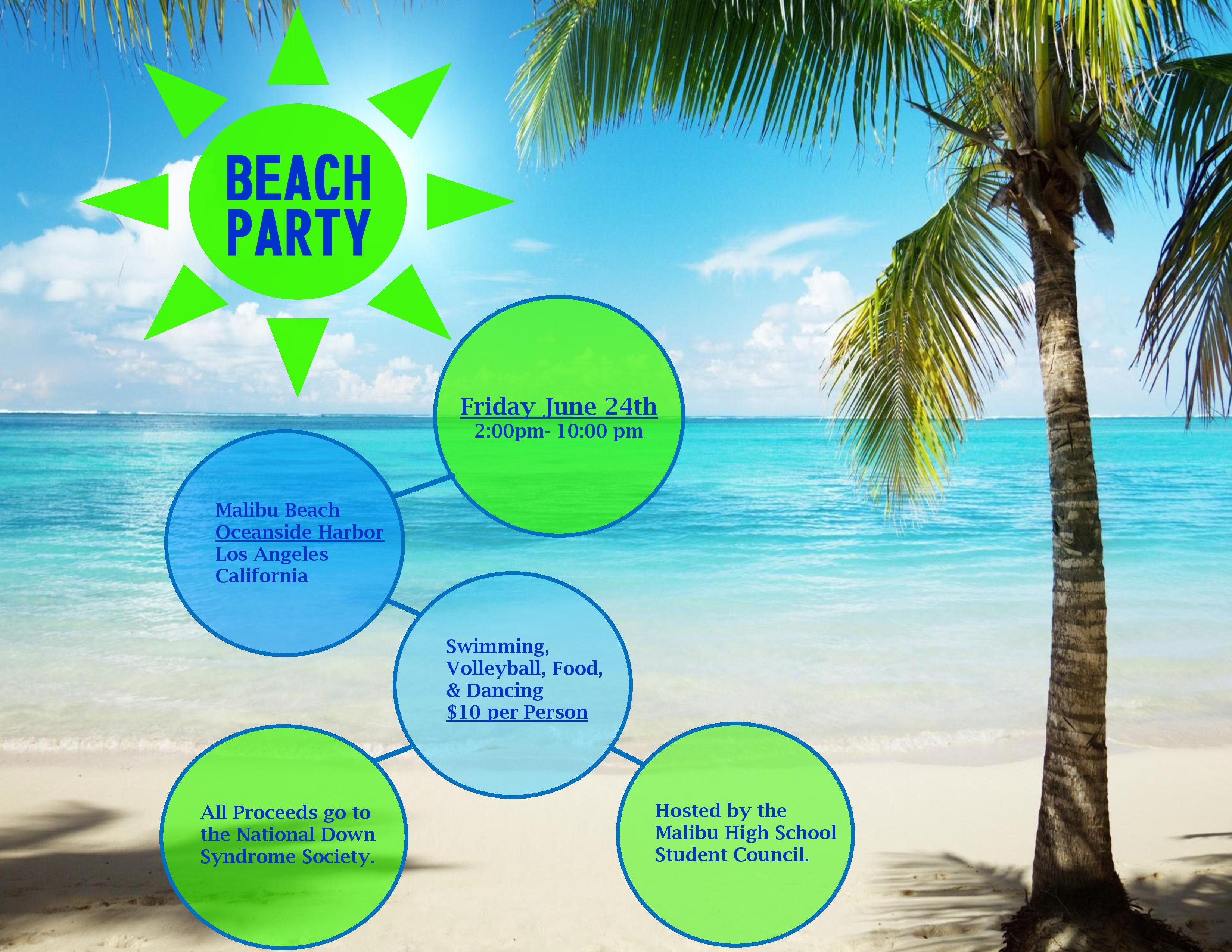

Process: My message was to advertise an event, to reach all high school students at Malibu High School in California, and get them to come to this event to support Down Syndrome! I picked fun and bright colors and an appealing image to try and portray the vibe that will be at this party. I found this image with an analogous color scheme and kept the analogous color scheme within the circles and text. I picked pretty simple fonts so because I didn’t want my design with the circles and the image to be too much with complex fonts. I really enjoyed the typography that I chose. Once I had the image and the design I wanted to use, I put the picture into Word and added the shapes and the body text and changed the colors to follow my color scheme. I was super happy with how it turned out.
Critique Process: I got critique from Jaclyn Stephens, Shawdee Snow, and Christina Carrick from the facebook page on Tuesday and they suggested that I either eliminate the lines connecting my circles or make them look more finished. They suggested that I condense the information and pick one color of green and blue. Sister Peterson also gave me a video critique on Wednesday suggesting that I make the sun the main circle for the title, change the font and the size of the body text. Also, she suggested that I put the title words closer together. I took their advice and changed the lines to be bolder and changed the body text to 12 pt. I got rid of the circle around the Title and just left the sun. I picked one blue and one green and changed the transparency to create variety. I changed the body text font so that it wasn’t all capitalized.
Color Scheme: Analogous: Green, Teal, Blue, Royal Blue
Fonts: Title- HGHeiseiKakugothictaiW9 (San Serif) Body Copy-Lucida Bright (Serif)
Link to image: http://cdn.wonderfulengineering.com/wp-content/uploads/2016/01/beach-wallpaper-9.jpg

This has been such a fun project! Thanks for anyone that has checked out my blog!!! 🙂
https://meganrandallsite.wordpress.com/2016/02/04/event-ad-project/
LikeLike
I fell in love with Megan Davis’s Project! If you like mine, you might like hers as well! 🙂
https://megnicoledavis.wordpress.com/category/design/
LikeLike
Your flier looks amazing. I love to see everyone’s progress and where we all end up! Sister P and the FB groups does such a good job of giving us feed back and ideas to consider. Your flier flows every well and you chose a great color scheme that compliments your photo nicely. Great job! You should check out another Meghan’s flyer here: https://meghanfarner.wordpress.com/2016/02/04/event-flier-project/
LikeLike
I love how this turned out! It is so bright and engaging. I think this was such a creative and unique flyer! You did a beautiful job!
https://christinacarrick.wordpress.com/2016/02/04/event-flyer/
LikeLike
https://katemichelleee.wordpress.com/2016/02/04/event-ad-project/comment-page-1/#comment-9
LikeLike