For this magazine project, I will be creating a two-page spread of an LDS magazine article in the New Era. For my magazine spread story, I chose to write to an audience of teenagers since my own story took place when I was a teenager. I’m focusing on the people who have fears and the blessings that come when they learn how to face their fears. I wrote about my experience at girls camp a few years go. I told how I was terrified to repel down a tall mountain but Heavenly Father gave me the strength, courage, and comfort I needed to get down the cliff. It relates to my audience because everyone has fears of what is to come but trusting in Heavenly Father can get you through any situation. Here is my story and the images I want to use.
Story: Faith Overcomes Fears
There are not many things in this life that I looked forward to more than summertime. Specifically, the one week during summer where I sang my heart out, grew my testimony, and bonded with all the other girls in my ward. Girl’s Camp was always one of my favorite weeks. My excitement before my third year at Girl’s Camp was no different from the rest except that year I was filled with excitement and fear. I knew it was my year to do something different than the normal hike on Wednesday. All of the third year girls were required to go repelling down a two hundred and fifty feet mountain. I was terrified, to say the least. Before going to camp, I spent a good majority of my time thinking about how I could get myself out of it. I was scared and told myself that there was no way I could do it. Not only were heights one of my biggest fears, I did not have the confidence or trust that the professional who would be belaying me would get me down safely. I was already convinced I could not do it.
I felt like I was waking up to a nightmare as my leaders shook our tent to wake us up on that Wednesday morning. Could I pretend I was sick? I knew that no one would believe me so I got up on that early morning and started getting my stuff together. I was still secretly hoping that once I got there, they would not really make me do it. We arrived at the cliff and I was a million times more scared than I was before. I started walking up the trail with all of my friends and tried to convince myself that it was not really that high. It was really steep walking up and before I had even realized it, I was already almost to the top. The biggest mistake I made was turning around and looking back. I had two options at that point. I either had to face my fears and repel down the cliff or embarrass myself by sliding all the way back down since it was too steep to walk. In that moment, my heart knew what I had to do. I was overcome with comfort and knew that I had to put faith in my Heavenly Father that He would help me make it down safely.
I put on all my ropes and very hesitantly turned around to repel down the mountain. The professional told me to take a step back. At first, I thought he was crazy. Here was this man that I did not know, telling me to take a step backward off of this cliff. The thought again came to my mind, have faith. I stumbled getting down the first part of the mountain but about half way down, I had finally gotten a hang of it. My feet finally touched the ground and I could not contain my joy. I had conquered my fear and nothing felt better than that very moment.
I did not particularly enjoy every second but I was so happy that I was able to overcome my fear. I learned four important things that day. The first thing is that I do not like repelling. The second thing I learned was that Heavenly Father never leaves our side. He was with me the whole way down the mountain. When we need him the most, he is always listening and comforting us. The third thing I learned that day was Heavenly Father really does strengthen us. He turns our weaknesses into strengths. Heavenly Father gave me the strength and courage that I needed to make it down the mountain. Without him, I know I would never have made it. The last thing that I learned that day on the mountain is that you cannot have faith and fear at the same time. Always let your faith overcome your fears.
Sketches

Images
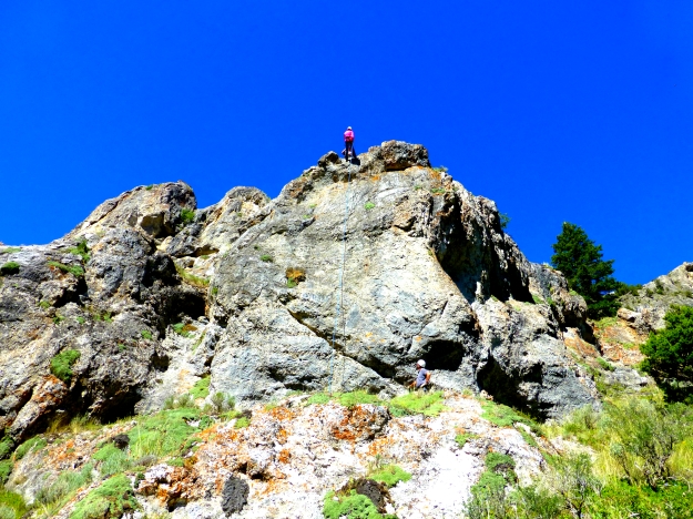

Image Sources:
The first image is my own.
Shoes- http://u.slimg.com/smartertravel/gallery/cover/originals/stm52161ca204fd820130822.jpg


